请注意,本文编写于 147 天前,最后修改于 147 天前,其中某些信息可能已经过时。
目录
文本溢出隐藏是常见的需求,如果把需求升级为超出指定的几行隐藏呢,常见的作法是
.ellipsis-container {
  display: -webkit-box;
  -webkit-box-orient: vertical;
  -webkit-line-clamp: 3; /* 限制文本显示为3行 */
  overflow: hidden;
}
但是这种css方案有浏览器兼容性问题,火狐不支持。这种时候不得不使用javascript来实现,我们将实现一个Vue组件,需求如下:
- 组件接收 title属性或slot内容,表示标题,如果没有则不显示标题。
- 组件接收 maxHeight 属性,表示文本最多显示多少行,默认3行,超出则隐藏。
- 鼠标悬浮tooltip 提示,鼠标移入时显示全部
- 组件接收 ellipsis 属性,表示文本超出时显示的省略号,默认"..."。
- 组件接收 showMore 属性(下拉或收起的图标),表示是否显示“显示全部”按钮,默认显示。下拉或收起时要有动画过度。
- 适配移动端,手机屏幕宽度小于768px时,隐藏标题。
- 兼容主流浏览器,IE9+、Chrome、Firefox、Safari、Opera。
- 适配不同的字体,使用不同的font-family,maxHeight不受影响
- 使用ts setup 语法
TextOverflow.vue
vue<template>
  <div class="text-overflow-container" :class="{ 'mobile': isMobile }">
    <!-- 标题部分 -->
    <div v-if="hasTitle" class="text-overflow-title">
      <slot name="title">
        {{ title }}
      </slot>
    </div>

    <!-- 文本内容容器 -->
    <div
      ref="contentRef"
      class="text-overflow-content"
      :class="{ 'collapsed': !isExpanded && isOverflow }"
      :style="{
        maxHeight: isExpanded ? 'none' : `${lineHeight * maxHeight}px`,
        '--line-height': `${lineHeight}px`
      }"
      @mouseenter="handleMouseEnter"
      @mouseleave="handleMouseLeave"
    >
      <slot name="default">
        {{ title }}
      </slot>
      <span v-if="!isExpanded && isOverflow" class="ellipsis">{{ ellipsis }}</span>
    </div>

    <!-- Tooltip 提示 -->
    <div
      v-if="showTooltip"
      class="text-overflow-tooltip"
      :class="tooltipClass"
      :style="{
        top: `-${tooltipOffset}px`,
        ...tooltipStyle
      }"
      @mouseenter="handleTooltipMouseEnter"
      @mouseleave="handleTooltipMouseLeave"
    >
      <div class="tooltip-content">
        <slot name="tooltip">
          <slot name="default">
            {{ title }}
          </slot>
        </slot>
      </div>
    </div>

    <!-- 优化后的按钮区域:与文本容器对齐 + 外层包裹 -->
    <div v-if="showMore && isOverflow" class="text-overflow-btn-wrap">
      <button
        class="text-overflow-toggle"
        @click="toggleExpand"
        :aria-expanded="isExpanded"
      >
        <span class="btn-text">{{ isExpanded ? '收起' : '显示全部' }}</span>
        <span class="toggle-icon" :class="{ 'rotate': isExpanded }">▼</span>
      </button>
    </div>
  </div>
</template>

<script setup lang="ts">
import { ref, computed, onMounted, onUnmounted, watch,useSlots } from 'vue';

interface Props {
  title?: string;
  maxHeight?: number;
  ellipsis?: string;
  showMore?: boolean;
  tooltipClass?: string;
  tooltipStyle?: Record<string, string>;
  tooltipOffset?: number;
  tooltipMaxHeight?: number;
  tooltipMaxWidth?: number;
  // 新增:按钮自定义属性
  btnTextColor?: string;
  btnHoverColor?: string;
}

const props = withDefaults(defineProps<Props>(), {
  maxHeight: 3,
  ellipsis: '...',
  showMore: true,
  tooltipOffset: 10,
  tooltipMaxHeight: 150,
  tooltipMaxWidth: 300,
  btnTextColor: '#1890ff',
  btnHoverColor: '#40a9ff'
});

// 响应式数据
const contentRef = ref<HTMLDivElement | null>(null);
const isExpanded = ref(false);
const isOverflow = ref(false);
const isMobile = ref(false);
const showTooltip = ref(false);
const lineHeight = ref(24);
const isMouseInTooltip = ref(false);
const tooltipTimer = ref<number | null>(null);
const slots = useSlots();
// 是否有标题
const hasTitle = computed(() => {
  return !!props.title || !!slots.title;
});

// 处理窗口大小变化
const handleResize = () => {
  isMobile.value = window.innerWidth < 768;
  checkOverflow();
};

// 检查文本是否溢出
const checkOverflow = () => {
  if (contentRef.value) {
    contentRef.value.style.maxHeight = 'none';
    const scrollHeight = contentRef.value.scrollHeight;
    contentRef.value.style.maxHeight = isExpanded.value ? 'none' : `${lineHeight.value * props.maxHeight}px`;

    const computedStyle = window.getComputedStyle(contentRef.value);
    const computedLineHeight = computedStyle.lineHeight;
    lineHeight.value = computedLineHeight === 'normal' ? 24 : parseFloat(computedLineHeight);

    isOverflow.value = scrollHeight > lineHeight.value * props.maxHeight;
  }
};

// 切换展开/收起状态
const toggleExpand = () => {
  isExpanded.value = !isExpanded.value;
  setTimeout(checkOverflow, 300);
};

// 文本容器鼠标进入
const handleMouseEnter = () => {
  if (isOverflow.value && !isExpanded.value) {
    clearTimeout(tooltipTimer.value!);
    tooltipTimer.value = setTimeout(() => {
      showTooltip.value = true;
    }, 200);
  }
};

// 文本容器鼠标离开
const handleMouseLeave = () => {
  clearTimeout(tooltipTimer.value!);
  tooltipTimer.value = setTimeout(() => {
    if (!isMouseInTooltip.value) {
      showTooltip.value = false;
    }
  }, 100);
};

// tooltip鼠标进入
const handleTooltipMouseEnter = () => {
  isMouseInTooltip.value = true;
  showTooltip.value = true;
};

// tooltip鼠标离开
const handleTooltipMouseLeave = () => {
  isMouseInTooltip.value = false;
  setTimeout(() => {
    showTooltip.value = false;
  }, 100);
};

// 监听属性变化
watch([() => props.maxHeight, () => props.ellipsis], () => {
  checkOverflow();
});

watch(isExpanded, () => {
  if (contentRef.value) {
    contentRef.value.style.maxHeight = isExpanded.value ? 'none' : `${lineHeight.value * props.maxHeight}px`;
  }
});

// 生命周期
onMounted(() => {
  handleResize();
  window.addEventListener('resize', handleResize);
  setTimeout(() => {
    checkOverflow();
  }, 0);
});

onUnmounted(() => {
  window.removeEventListener('resize', handleResize);
  if (tooltipTimer.value) clearTimeout(tooltipTimer.value);
});
</script>

<style scoped>
.text-overflow-container {
  position: relative;
  width: 100%;
  box-sizing: border-box;
  /* 统一容器内间距 */
  padding: 8px 0;
}

/* 标题样式优化 */
.text-overflow-title {
  font-weight: 600;
  margin-bottom: 8px;
  font-size: 16px;
  line-height: 1.5;
  color: #333;
}

.mobile .text-overflow-title {
  display: none;
}

/* 文本内容容器优化 */
.text-overflow-content {
  position: relative;
  line-height: var(--line-height);
  overflow: hidden;
  transition: max-height 0.3s ease-in-out; /* 更顺滑的动画 */
  word-break: break-all;
  box-sizing: border-box;
  color: #666;
  /* 文本容器内边距,与按钮对齐 */
  padding-right: 4px;
}

.collapsed {
  position: relative;
}

/* 省略号优化:背景与文本容器一致,避免遮挡 */
.ellipsis {
  position: absolute;
  right: 0;
  bottom: 0;
  background-color: inherit;
  padding-left: 8px;
  /* 防止省略号被文字覆盖 */
  z-index: 1;
}

/* Tooltip 样式 */
.text-overflow-tooltip {
  position: absolute;
  left: 0;
  z-index: 999;
  padding: 8px 12px;
  border-radius: 4px;
  max-width: v-bind('props.tooltipMaxWidth + "px"');
  min-width: 200px;
  word-break: break-all;
  box-sizing: border-box;
  background-color: rgba(0, 0, 0, 0.8);
  color: #fff;
  overflow: hidden;
  box-shadow: 0 2px 8px rgba(0, 0, 0, 0.2);
}

.text-overflow-tooltip::before {
  content: '';
  position: absolute;
  bottom: -6px;
  left: 20px;
  width: 0;
  height: 0;
  border-left: 6px solid transparent;
  border-right: 6px solid transparent;
  border-top: 6px solid rgba(0, 0, 0, 0.8);
}

.tooltip-content {
  max-height: v-bind('props.tooltipMaxHeight + "px"');
  overflow-y: auto;
  scrollbar-width: thin;
  scrollbar-color: rgba(255,255,255,0.5) transparent;
  user-select: none;
  -webkit-user-select: none;
}

:deep(.tooltip-content::-webkit-scrollbar) {
  width: 4px;
}
:deep(.tooltip-content::-webkit-scrollbar-thumb) {
  border-radius: 2px;
  background-color: rgba(255,255,255,0.5);
}
:deep(.tooltip-content::-webkit-scrollbar-track) {
  background: transparent;
}

/* ========== 核心优化:按钮区域 ========== */
/* 按钮外层包裹:实现与文本容器左对齐,统一间距 */
.text-overflow-btn-wrap {
  margin-top: 12px; /* 与文本保持合理间距 */
  /* 关键:与文本容器padding一致,实现左对齐 */
  padding-right: 4px;
  box-sizing: border-box;
}

/* 按钮样式美化 */
.text-overflow-toggle {
  display: inline-flex; /* 改为inline-flex,避免占满整行 */
  align-items: center;
  gap: 6px; /* 文字与图标间距优化 */
  padding: 6px 12px; /* 增大点击区域 */
  border: none;
  border-radius: 4px; /* 圆角增加质感 */
  background-color: #f5f7fa; /* 浅背景色,增强区分度 */
  color: v-bind('props.btnTextColor');
  cursor: pointer;
  font-size: 14px;
  line-height: 1.5;
  /* 按钮动画 */
  transition: all 0.2s ease;
  /* 禁用文本选中 */
  user-select: none;
  -webkit-user-select: none;
}

/* hover状态优化:背景+文字颜色变化 */
.text-overflow-toggle:hover {
  background-color: #e6f7ff;
  color: v-bind('props.btnHoverColor');
}

/* 点击active状态:按压效果 */
.text-overflow-toggle:active {
  background-color: #d9efff;
  transform: translateY(1px);
}

/* 图标样式优化 */
.toggle-icon {
  display: inline-block;
  font-size: 12px;
  transition: transform 0.2s ease;
  /* 图标居中 */
  line-height: 1;
}

.rotate {
  transform: rotate(180deg);
}

/* 移动端按钮适配 */
.mobile .text-overflow-toggle {
  padding: 4px 10px;
  font-size: 13px;
}

/* 兼容样式 */
:deep(.text-overflow-content) {
  *zoom: 1;
}
:deep(.text-overflow-tooltip) {
  filter: progid:DXImageTransform.Microsoft.gradient(startColorstr=#CC000000, endColorstr=#CC000000);
}
</style>
使用
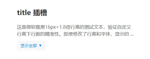
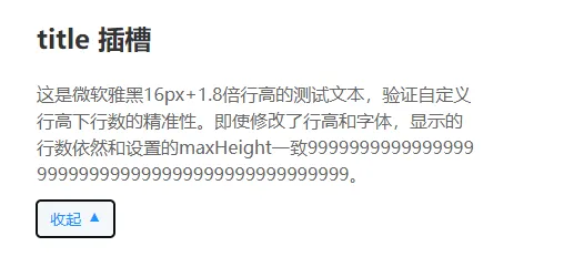
<!-- 测试不同字体:微软雅黑 + 16px + 自定义行高 -->
    <div style="font-family: Microsoft YaHei; font-size: 16px; line-height: 1.8; margin-bottom: 20px;">
      <TextOverflow maxHeight="2" showMoreText="查看更多" :tooltipStyle="{width:'400px'}" :tooltipMaxHeight="80">
        <template v-slot:title>
          <h2>title 插槽</h2>
        </template>
        这是微软雅黑16px+1.8倍行高的测试文本,验证自定义行高下行数的精准性。即使修改了行高和字体,显示的行数依然和设置的maxHeight一致9999999999999999999999999999999999999999999999。
      </TextOverflow>
    </div>
如果对你有用的话,可以打赏哦
打赏


本文作者:繁星
本文链接:
版权声明:本博客所有文章除特别声明外,均采用 BY-NC-SA 许可协议。转载请注明出处!
目录