请注意,本文编写于 154 天前,最后修改于 154 天前,其中某些信息可能已经过时。
目录
在前端开发中,CSS的transition属性允许我们在一定的时间范围内平滑地过渡一个元素从一种样式到另一种样式。然而,当涉及到高度(height)从0到auto的过渡时,事情会变得有些复杂,因为CSS无法直接计算auto值作为过渡的终点。
<body>
    <div class="container">
        <button class="btn">Hover me!</button>
        <div class="dropdown">
            <div>苹果~</div>
            <div>香蕉~</div>
            <div>水蜜桃~</div>
            <div>橙子~</div>
            <div>葡萄~</div>
        </div>
    </div>
</body>
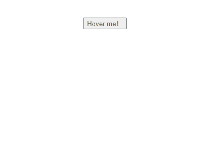
如果给.dropdown添加动画该如何实现呢
解决方法如下,有js方案也有css方案
方案一: js大法
html<!DOCTYPE html>
<html lang="en">

<head>
    <meta charset="UTF-8">
    <meta name="viewport" content="width=device-width, initial-scale=1.0">
    <title>Document</title>
    <style>
        body {
            padding: 20vh;
            margin: 0;
            height: 100vh;
            display: flex;
            align-items: center;
            flex-direction: column;
        }

        .dropdown {
            height: 0;
            transition: height 0.3s linear;
            overflow: hidden;
            color: #fff;
            background-color: #5468ff;
        }
    </style>

    <script>
        document.addEventListener('DOMContentLoaded', function () {
            const btnEle = document.getElementsByClassName('btn')[0];
            const dropdownEle = document.getElementsByClassName('dropdown')[0];
            // 初始化时计算内容真实高度
            dropdownEle.style.height = 'auto';
            const contentHeight = dropdownEle.scrollHeight;
            dropdownEle.style.height = '0px'; // 重置为0以隐藏内容

            // 添加mouseover事件监听器
            btnEle.addEventListener('mouseover', function () {
                dropdownEle.style.height = contentHeight + 'px';
            });
            // 添加mouseout事件监听器
            btnEle.addEventListener('mouseout', function () {
                dropdownEle.style.height = '0px';
            })
        });

    </script>

</head>

<body>
    <div class="container">
        <button class="btn">Hover me!</button>
        <div class="dropdown">
            <div>苹果~</div>
            <div>香蕉~</div>
            <div>水蜜桃~</div>
            <div>橙子~</div>
            <div>葡萄~</div>
        </div>
    </div>
</body>

</html>
方案二: flex
flex 布局,其最大高度(max-height)的行为有所不同。在弹性布局中,最大高度的值将始终是弹性布局的高度。 但是需要一个额外的容器
html<!DOCTYPE html>
<html lang="en">

<head>
    <meta charset="UTF-8">
    <meta name="viewport" content="width=device-width, initial-scale=1.0">
    <title>Document</title>
    <style>
        body {
            padding: 20vh;
            margin: 0;
            height: 100vh;
            display: flex;
            align-items: center;
            flex-direction: column;
        }

        .dropdown {
            transition: all 0.3s ease;
            overflow: hidden;
            color: #fff;
            background-color: #5468ff;
            /* 通过max-height来过渡 */
            max-height: 0;
        }

        .dropdown>div {
            height: 34px;
            line-height: 34px;
            padding: 0 10px;
        }

        .container:has(.btn:hover) .dropdown {
            /* 通过max-height来过渡 */
            max-height: 100%;
        }

        /* 使用flex布局 */
        .dropdown-box {
            display: flex;
        }
    </style>


</head>

  <body>
    <div class="container">
      <button class="btn">Hover me!</button>
      <div class="dropdown-box">
        <!-- 额外必须的div -->
        <div>
          <div class="dropdown">
            <div>苹果~</div>
            <div>香蕉~</div>
            <div>水蜜桃~</div>
            <div>橙子~</div>
            <div>葡萄~</div>
          </div>
        </div>
      </div>
    </div>
  </body>
</html>
方案三: grid(fr)
利用grid-template-rows属性来控制内部空间的大小从而实现高度从 0 到自动的动画
html<!DOCTYPE html>
<html lang="en">

<head>
    <meta charset="UTF-8">
    <meta name="viewport" content="width=device-width, initial-scale=1.0">
    <title>Document</title>
    <style>
        body {
            padding: 20vh;
            margin: 0;
            height: 100vh;
            display: flex;
            align-items: center;
            flex-direction: column;
        }

        .dropdown {
            overflow: hidden;
            color: #fff;
            background-color: #5468ff;
        }

        .dropdown>div {
            height: 34px;
            line-height: 34px;
            padding: 0 10px;
        }

        .container:has(.btn:hover) .dropdown-box {
            grid-template-rows: 1fr;
        }

        .dropdown-box {
            display: grid;
            grid-template-rows: 0fr;
            transition: grid-template-rows 0.5s ease-out;
        }
    </style>


</head>

<body>
    <div class="container">
        <button class="btn">Hover me!</button>
        <div class="dropdown-box">
            <div class="dropdown">
                <div>苹果~</div>
                <div>香蕉~</div>
                <div>水蜜桃~</div>
                <div>橙子~</div>
                <div>葡萄~</div>
            </div>
        </div>
    </div>
</body>


</html>
如果对你有用的话,可以打赏哦
打赏


本文作者:繁星
本文链接:
版权声明:本博客所有文章除特别声明外,均采用 BY-NC-SA 许可协议。转载请注明出处!
目录